Designed it, built it, then let the data tune it
A recipe site I designed and built, then kept improving once real visitors showed us what they actually needed.
What it is
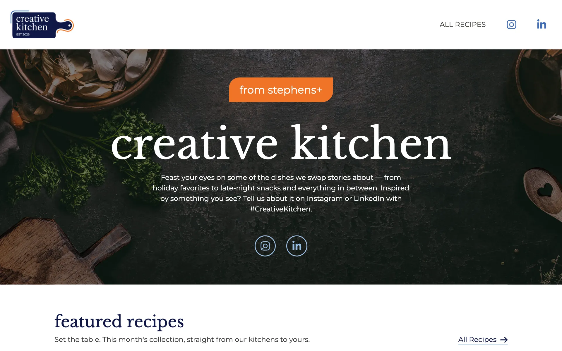
Creative Kitchen is a recipe collection from the people at Stephens+. It's the dishes we swap stories about, from holiday favorites to late-night snacks, with a newsletter sign-up and an invitation to share on social.
My part
I designed and built the site, then ran the data-driven optimizations after launch: watching how people used it, changing whatever got in their way, and measuring the result.
Key decisions
Let the food lead
Big photography does the selling. Each card only carries the dish, who shared it and a way in, so the grid stays easy to scan and every recipe feels like it came out of someone's real kitchen.
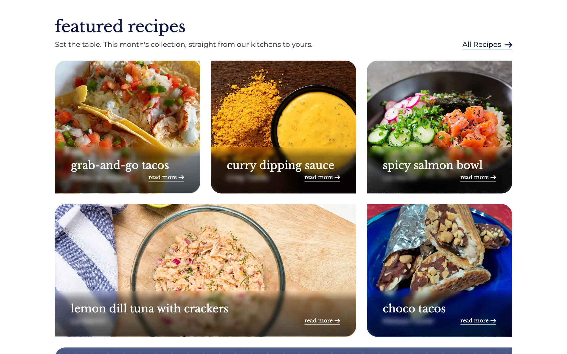
Big photography leads, and each card carries just the dish, who shared it and a way in. (Contributor names are blurred here.) Ship, then let the data decide
Each month a card above the recipes announced the theme (BBQ month, for example). The data said it had to go. Nearly every visitor came from our newsletter, which already told them the theme. People kept dead-clicking it, expecting a featured page, when the home page already was the featured page. And it pushed the recipes further down. So we cut it and tightened up the vertical spacing, since scroll depth showed people stopping short.
One easy column on a phone
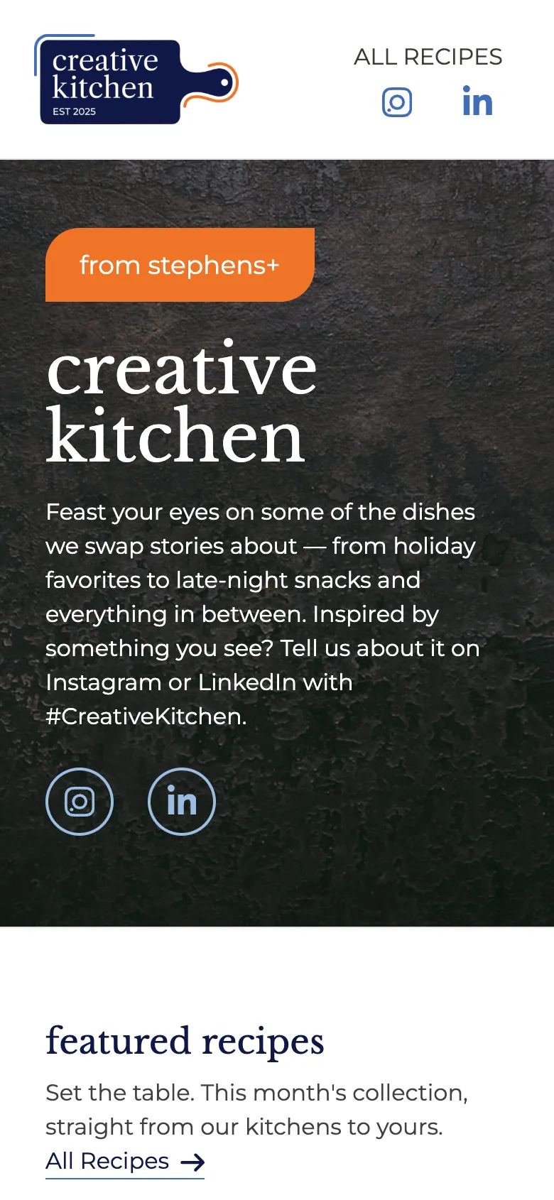
On a phone everything stacks into a single column: logo and links, then the intro, then the recipes, one big card at a time.
On a phone, everything stacks into one easy column.
See it live ↗ (opens in a new tab)
The live site may have changed since I captured it in Oct 2026. See the archived version (opens in a new tab).